Journal
Drop 01 notes: graphics, utility, and movement
Drop 01 is built around movement: graphic energy where it matters, quieter construction everywhere else, and garments designed to live beyond one campaign image.
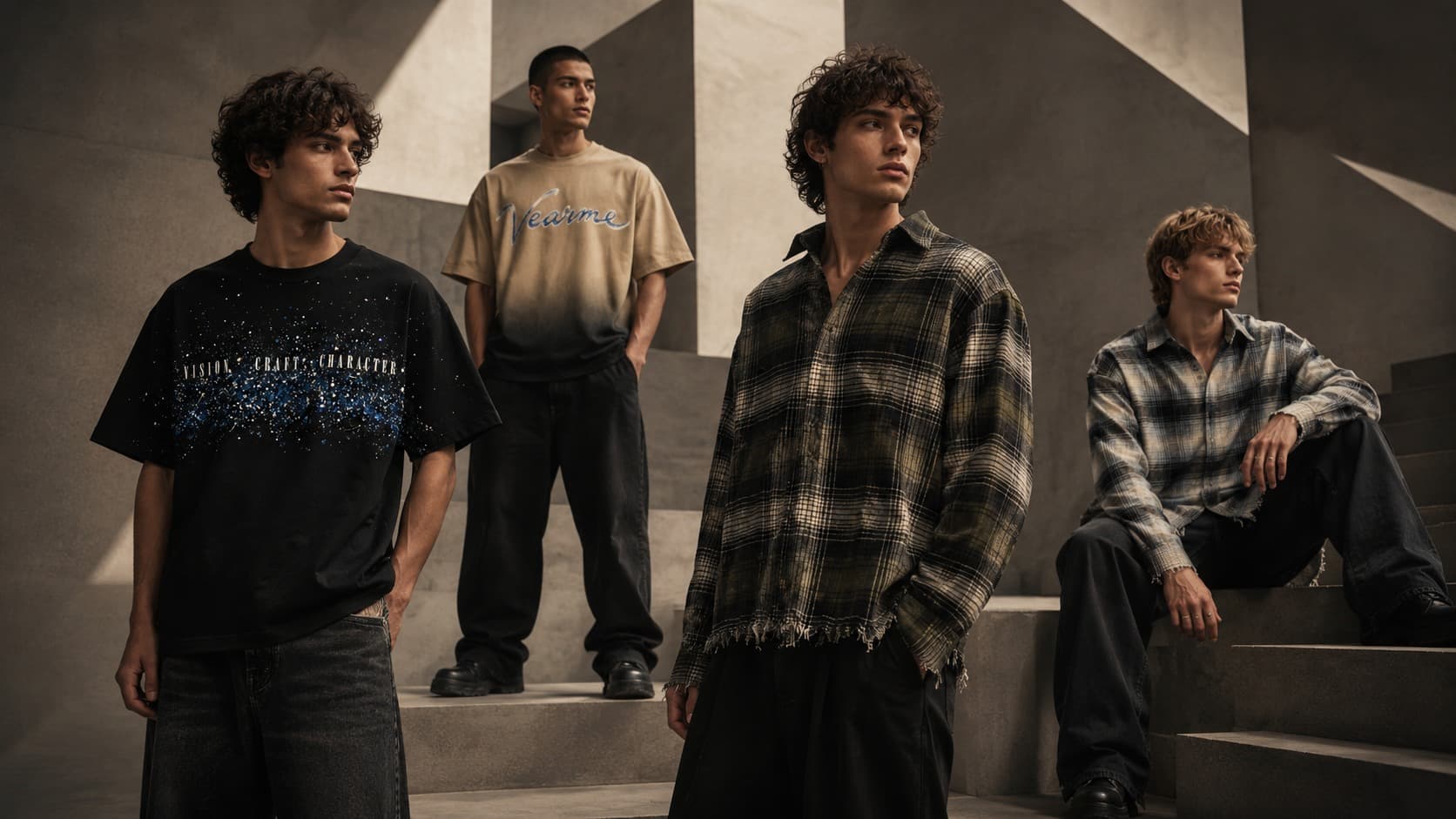
The first VEARME drop is less about proving how many ideas we can fit into a garment and more about deciding which ideas deserve to stay.
Graphic tension
The artwork is placed to interrupt otherwise clean silhouettes. Instead of covering every surface, the graphics create a focal point and leave enough negative space for the garment itself to read.
Utility as a visual language
Utility details only work when they have a reason to exist. Pockets, hardware, labels and seams should either improve the garment or sharpen its character; decoration for its own sake gets removed.
Built for motion
The collection is tested while walking, sitting and layering because clothes are not viewed as flat product shots in real life. Ease, length and fabric recovery are part of the design language.
- Relaxed, controlled silhouettes
- Layer-friendly proportions
- Durable print and trim choices
- A consistent visual system across the drop
Drop 01 sets the rules we can build on: fewer disconnected ideas, stronger repetition, and enough restraint for each piece to become part of someone else’s character.